Work / Branding / Web development
Qatar Friendship Fund
The Qatar Friendship Fund (QFF) was established with a focus on healthcare, education, and fisheries. The challenge was to develop a consistent brand for QFF while maintaining a sense of modesty and effectively communicating their story to the world.
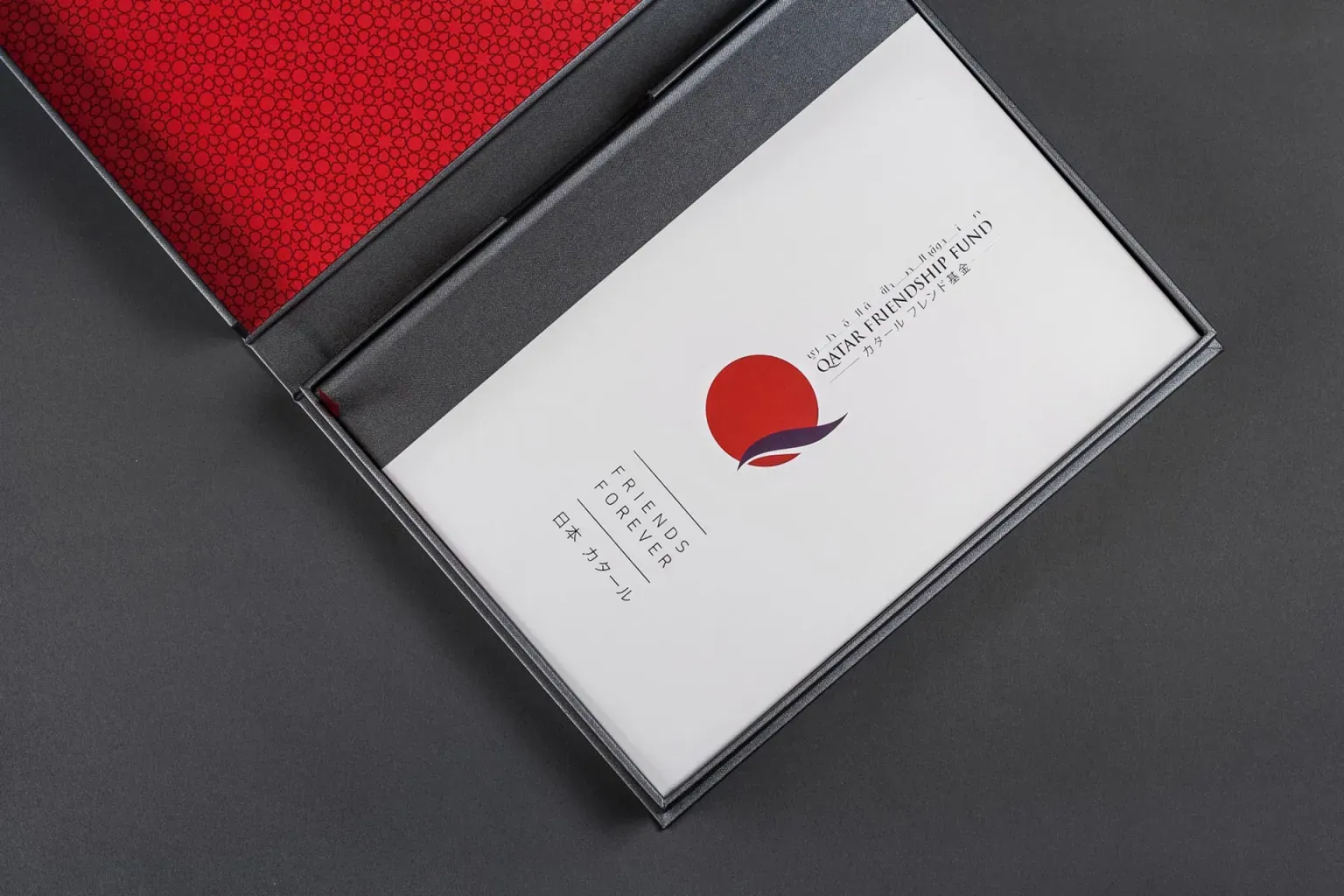
The identity centers on a red sun with a flowing purple band, with the fund's name set in Arabic, English and Japanese.
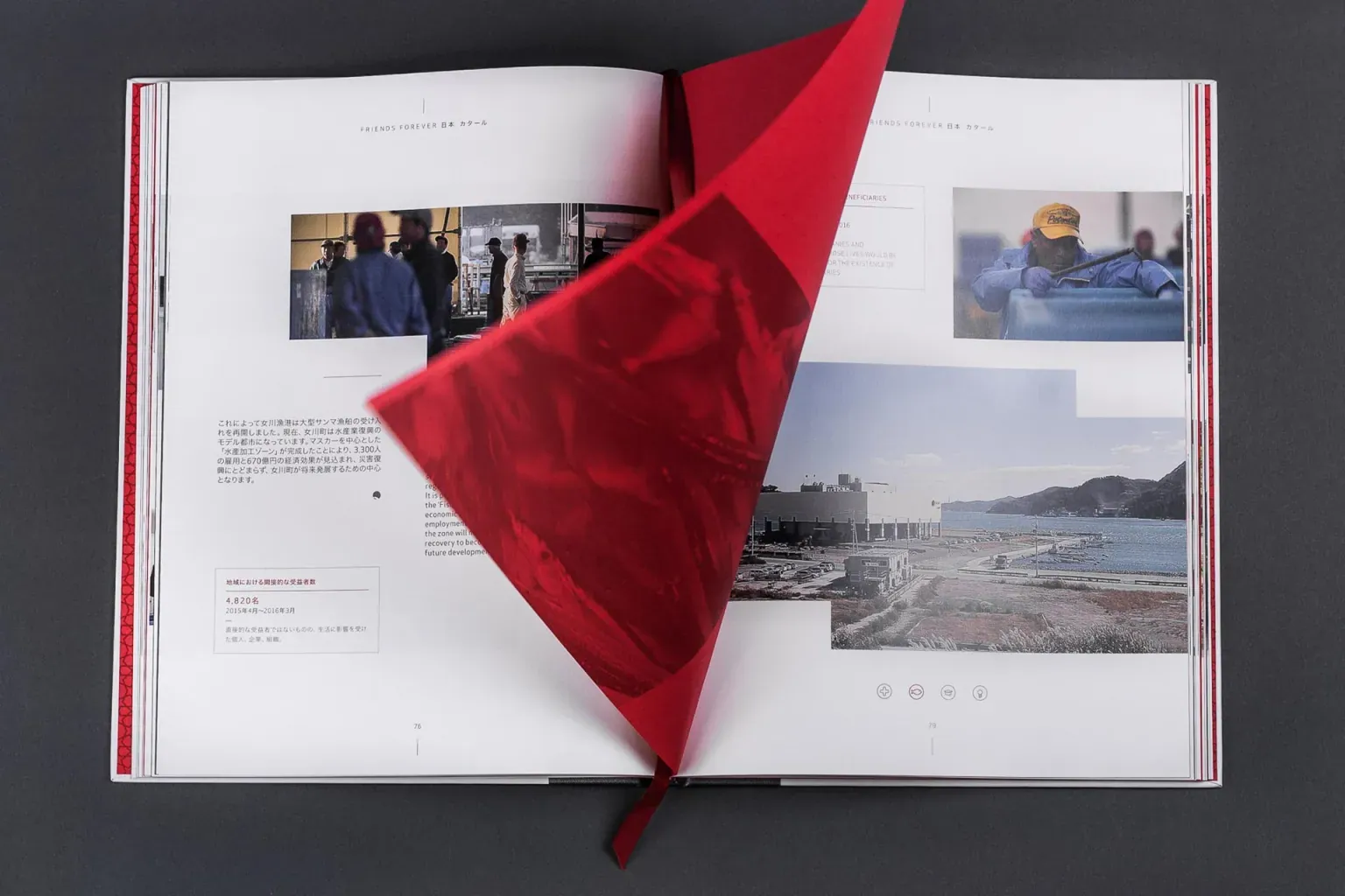
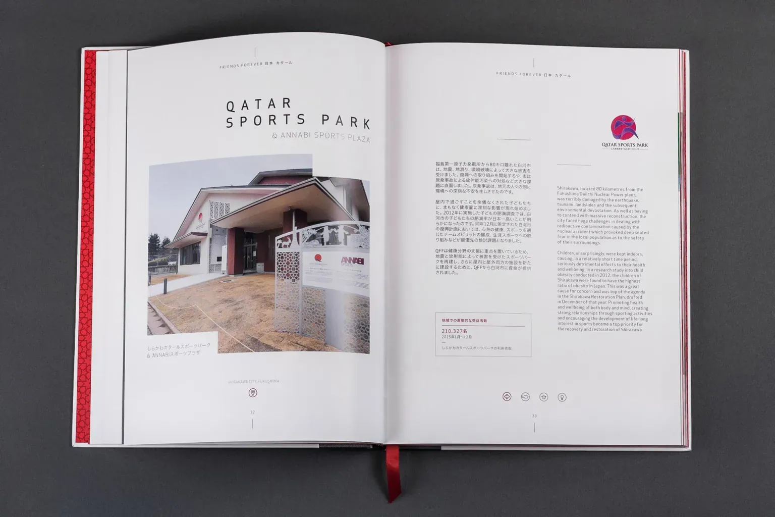
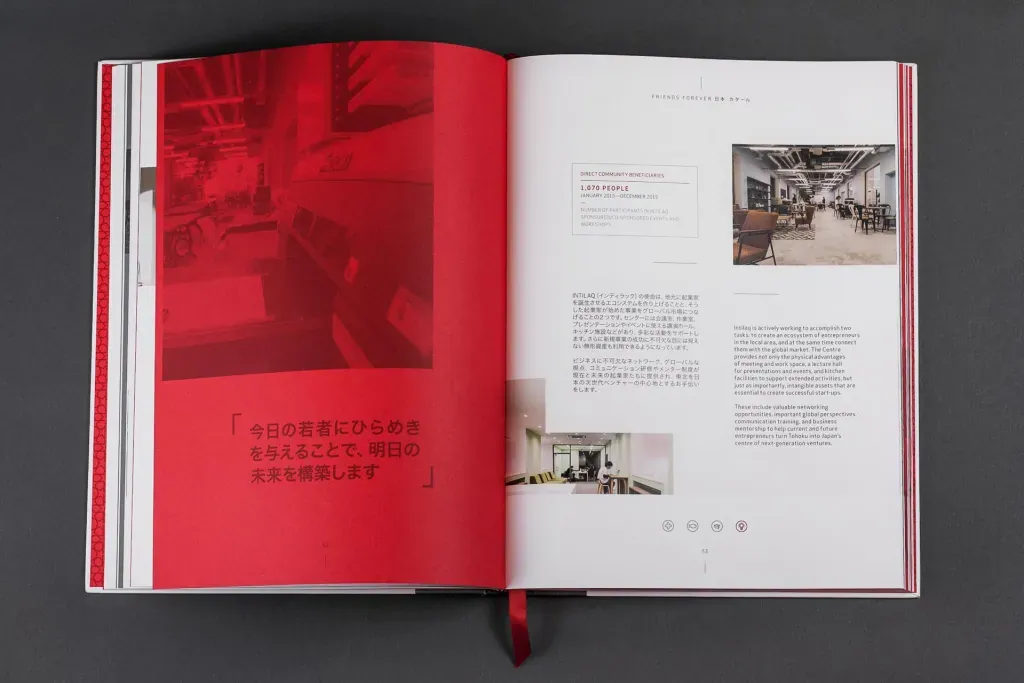
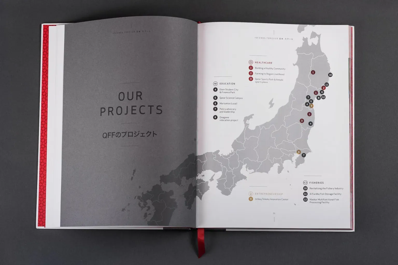
The book presents the fund's projects in Japan, including a map of project locations and profiles such as the Qatar Sports Park, in a restrained layout that lets photography lead.
Highlights
- 01
Trilingual logo
A red sun and purple wave mark with the fund's name in Arabic, English and Japanese.
- 02
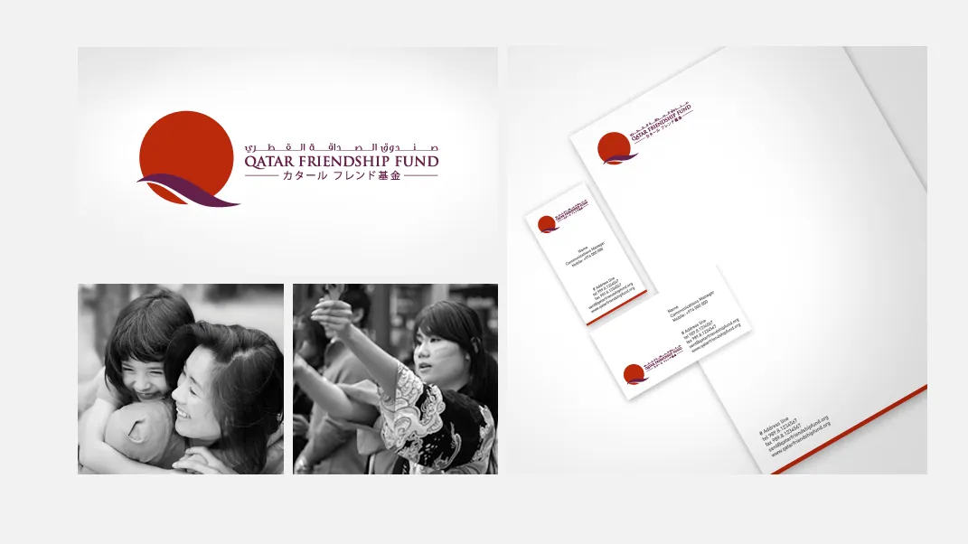
Stationery
Business cards and letterhead using the mark and a thin red rule.
- 03
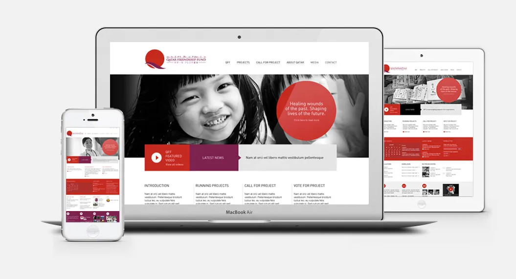
Responsive website
A site laid out for desktop, tablet and phone, leading with portrait photography and project stories.
- 04
Hardcover book
A cloth-bound book with a red ribbon marker, red section pages, project spreads and a map of project locations in Japan.
- 05
Presentation box
A fitted box with a red textured lid and the line “Friends Forever”, holding the book for presentation.
The work
A consistent, modest brand and web presence for a fund focused on healthcare, education, and fisheries.