Work / Brand identity
Origin
A brand identity for Origin Group, an arts-focused brand, covering its wordmark, typography, packaging, signage and event materials.
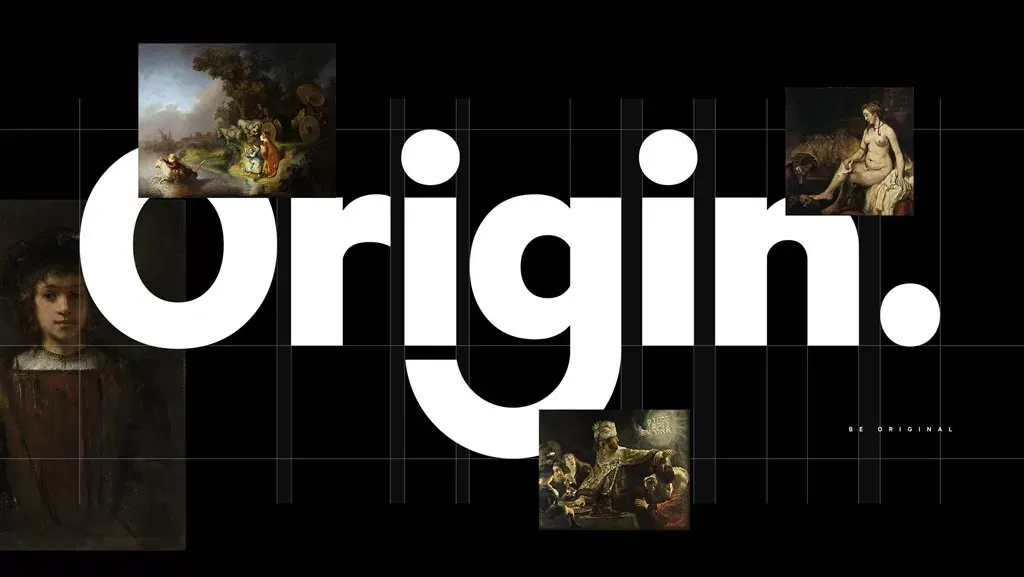
The identity rests on a heavy, rounded wordmark and a short line, “Be Original”, set on black, white and textured gray grounds.
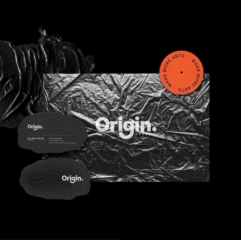
Classical artwork and a stamped “Make More Arts” seal connect the brand to the arts, while the typography stays modern and plain.
Highlights
- 01
Wordmark
A bold lowercase “Origin.” with a full stop, used large on posters and small on labels, tape and tickets.
- 02
Typography
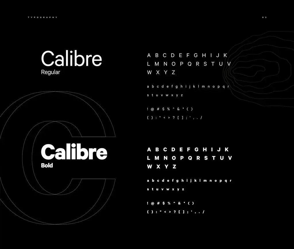
Calibre in regular and bold weights, carrying headlines, listings and small print across every item.
- 03
Stationery and packaging
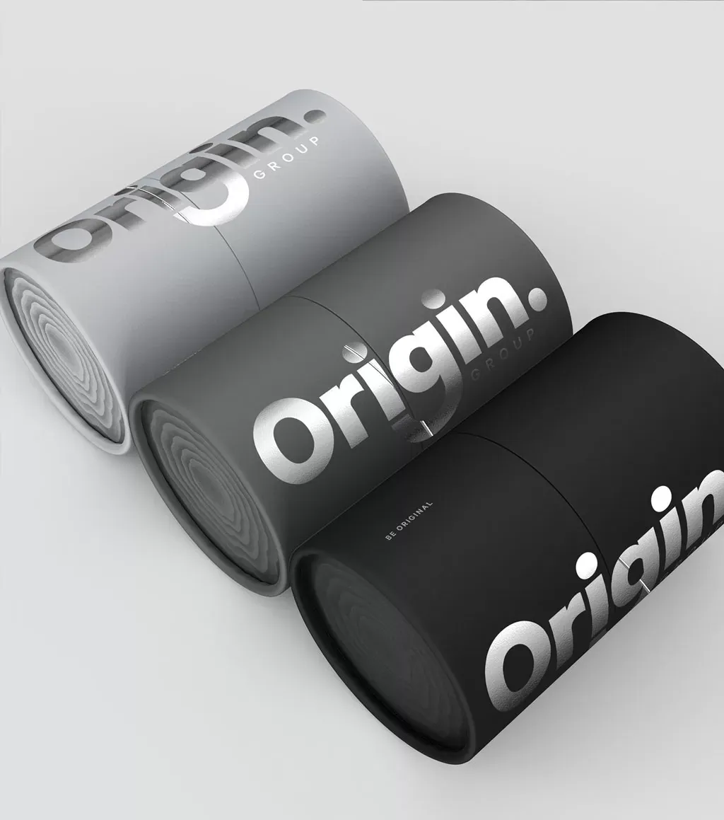
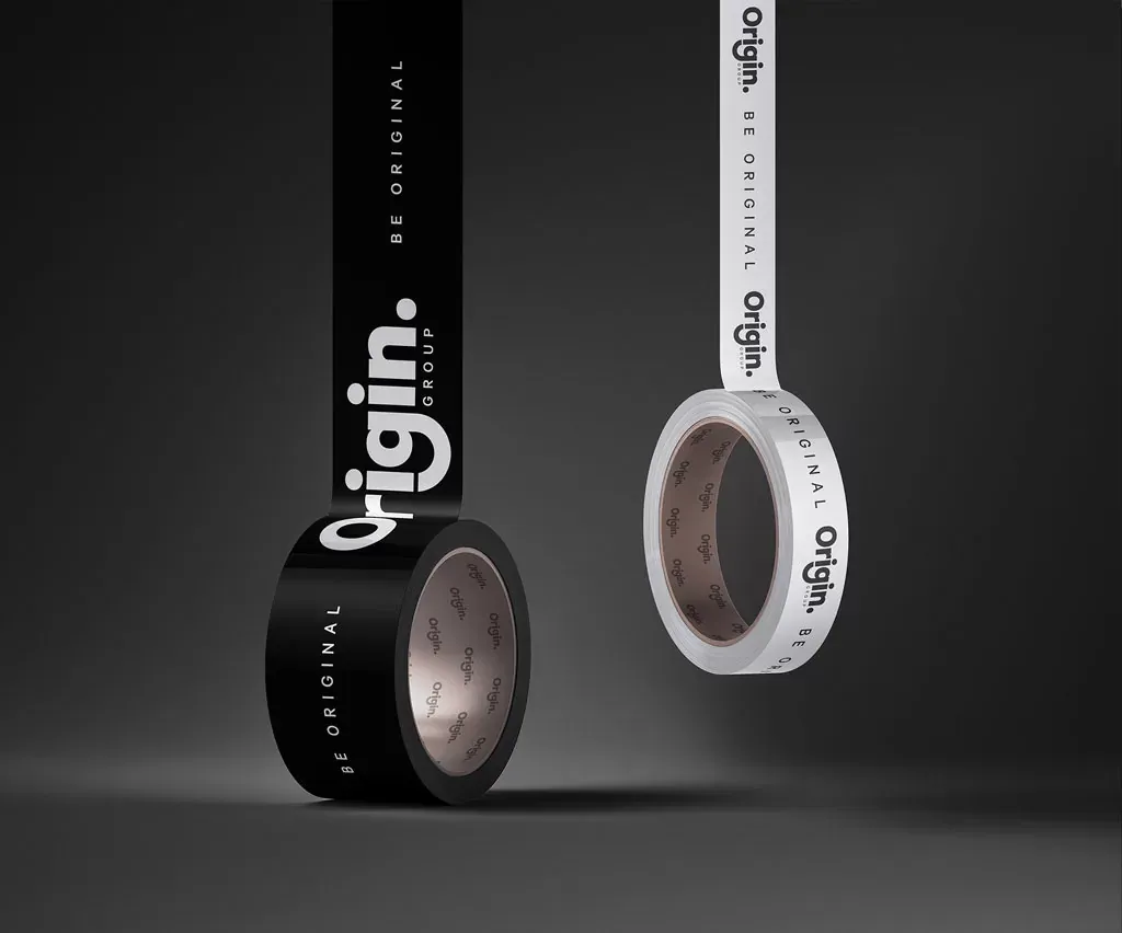
Business cards on a crumpled-texture ground, black and white packaging tubes, and branded packing tape.
- 04
Signage and outdoor
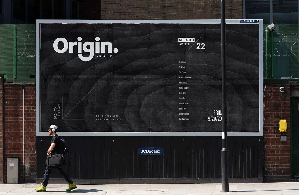
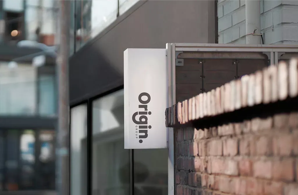
An exterior blade sign and a large street billboard announcing a selected artist program.
- 05
Event tickets
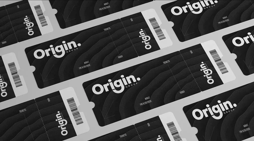
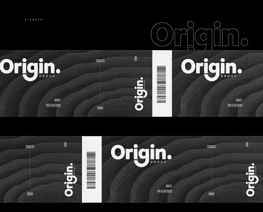
Ticket designs with a tear-off stub, a barcode and the textured ground used across the identity.
The work
A comprehensive branding and design system where creativity meets strategy.